Wednesday, April 27, 2011

This Week’s Photography Class Assignment

I am really becoming more aware of how to design photographs.  I don’t always get it right, but I think I’m more aware of what I did wrong when I look at my pictures after the fact.  And hopefully I will learn from those mistakes.  I am also becoming more comfortable with changing some of the settings on my camera to get the look I am trying to achieve and for the best picture possible.  Less frustration = happier photographer = better pictures.  I hope.

This week we have Architecture and People or Pets.  Here you go:

The following are of a shop in Long Grove, IL.  I’m sure this used to be a house.  This is of the back of the house, but it is the side seen by many walkers/shoppers as it is in the courtyard type area of the cluster of buildings which house shops in that area.  And for the record, I drove by the front of it later and personally, I like the back better.

20110423--7

20110423--8

A corbel near the back entrance.

20110423--9

Next up is my people study.  These are from a portrait session with my husband.  I know they are the same pose, just different distances, but one other that I like, he didn’t like and I don’t want to put it up in case it embarrasses him.  Though I don’t think it is in any way, embarrassing.

20110424--10

20110424--11

One other thing.  I didn’t show some photos from last week’s class!

These are of the Church of the Holy Communion in Lake Geneva, WI.

20110416--2

20110416--3

Tuesday, April 26, 2011

Interview with a Poet During National Poetry Month

What a treat I have for you!  During the last few days of National Poetry Month, please enjoy an interview with my friend Tania Runyan, an award winning poet!

20110319--11

I met my friend Tania about 5 years ago through a small group from the church we attended.  Our group was so amazing and enlightening in that we all had strong relationships with each other regardless of our wildly differing philosophies.  Tania and I have kept in touch since our small group has disbanded and occasionally get together to go walking and talking.  And talking with Tania is always a pleasure!  She is an amazingly insightful, thoughtful, passionate, compassionate, and artistic person.  This all shows through in her poetry as well as her personality. 

Most recently, she has published a collection of poems in a book called Simple Weight.  This book is available through Amazon.com.  You can also read more about her at her website.

simpleweight

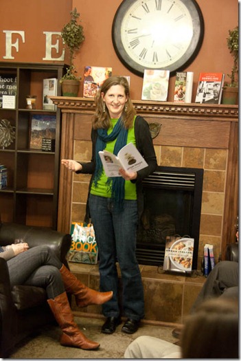
In March, Tania told me about a poetry reading she was doing from her new book in a nearby town called Antioch, which I happen to love.  My brother lived there for several years before getting married this March.  I was thrilled to have the free time to go and hear her poetry in her own voice.  It was a lovely evening and such an honor to be able to attend this event.
20110319--4

And without further ado, here is the interview!

KW: Could you give a brief background of where you are from and how you got to Illinois as well as how long you and Jeremy have been together an how old your kids are?

TR:  I grew up in Southern California, which is where I met Jeremy at the University of California, Riverside. We got married during our senior year of college, so that makes for 17 years! Our kids are Lydia, 8, Becca, who will be 6 in May, and Samuel, who will be 3 in May. There is no quick answer to how we got to Illinois, but the short of it is that a combination of grad school programs and careers brought us up here. Many people say I am crazy for leaving California, but I really love it here!


KW:  When did you first become interested in writing?

TR:  When I was 7, my babysitter, who was probably in sixth grade at the time, showed me two animal posters in her room. "Why don't we each pick one and write a story?" she asked. I ended up writing a story about a koala and was stunned by the freedom and excitement of creating with words. I have been hooked ever since.


KW:  What/who inspired you to start writing poetry?

TR: I came to poetry relatively late after seriously considering a career as a screenwriter. I always saw myself as more of a fiction writer or playwright until my high school creative writing teacher told me I was strongest with poetry. I went on to college again with playwriting on the mind, but I kept those teacher's words in my heart. Once I started taking poetry workshops in college, I knew poetry was my strongest suit.


KW:  What most inspires your writing?

TR:  Over the past few years, biblical texts have been most influential to my writing; I am writing almost exclusively on scripture, biblical figures, and my own personal experiences with faith.


KW:  What do you feel is/are the biggest misconception(s) about writing poetry?

TR:  It bothers me that while many people accept the fact that a good musician, dancer or actor must practice and rehearse, they believe poetry is some sacred, untouchable expression that nobody dare criticize. While poetry is indeed self-expressive, it is an art and a craft that deserves an artist's full attention. Poets indeed do and must practice and revise in order to improve. Scribbling off a poem in a journal and defending its artistic integrity as pure self-expression does not show respect toward the art. There is definitely a place for journal-writing; I keep a journal as well, and most of my poems grow out of those entries. But I would never dream of considering one of my spontaneous journal entries on equal par with a poem I've labored over for ten hours.


KW:  Who is/are your favorite contemporary poet(s) and why?

TR:  This list changes constantly, but right now I really enjoy reading poets who write from a context of faith, such as Paul Willis, Scott Cairns, and Barbara Crooker. I've also been exploring contemporary Welsh and Scottish poets, such as Anna Wigley and Kathleen Jamie. Their poetry is raw and searching but with exacting language--exactly what I try to emulate.


KW: Who is/are your favorite deceased poet(s) and why?

TR: I love Rilke for his soulful and haunting voice. If only I knew German!


KW: Which of your poems is your favorite?

TR: Probably "Blessed Are the Poor in Spirit" and "The Goldfish Pond."


KW:  When you are not writing, what do you enjoy doing?

TR:  I love gardening, especially propagating my own plants. I also play on the worship team at church: violin, mandolin, and bass. I am obsessed with Irish and Scottish music and enjoying playing that genre on my violin and mandolin as well.


KW:  What do you need to do your best work?

TR:  Coffee, good Celtic tunes, and a big chunk of time!


KW:  Please share what you feel are your greatest accomplishments in your writing.

TR:  I would have to say writing about the Bible in a way that is both personally authentic to me and interesting to others. Of course, I continue to work on this, as I feel I have further to go and deeper to delve.


KW:  What is your next goal in your poetry career?  In your life?

TR:  I am currently working on a book of poems based on the apostle Paul and his writings. The grant from the National Endowment for the Arts has afforded me time to really concentrate on this project. After that, I would like to work on a collection about revival, perhaps the revival in Wales or the Hebrides in Scotland. As for the rest of my life, I am interested in returning to the school setting once all three kids are in school--perhaps as a reading specialist or special Ed teacher. I am currently in the midst of figuring out what I want to do "when I grow up"!

20110319--9

Many thanks to Tania for taking the time to do this interview.  You are an amazing friend with amazing talent.  Dear readers, please do yourself a favor and go check out some of her work!

Sunday, April 24, 2011

Daffodil Girl

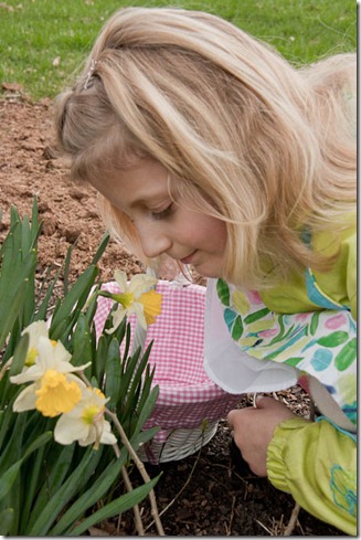
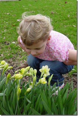
Each year since she was born, I have taken a photo of Ella by the daffodils.  All but one, so far, has been by the same daffodil patch in our backyard.  Here is this year’s edition:

2011 (7 yrs)

20110424--4

And all the others to date:

2010 (6 yrs)

20100404

2009 (5 yrs)

09daf

2008 (4 yrs)

08daff

2007 (3 yrs)

06-daff

2006 (2 yrs)

06daf

2005 (1 yr) – This one was at the mall waiting in line for the Easter bunny.

05daf

2004 (4 mos)

04dad

Monday, April 18, 2011

Which Would You Choose?

Well, it is about time for photography class again this week.  Last week was horribly cloudy, so I didn’t get out until Saturday to take pics for this week’s assignments.

One of the assignments was to take a bunch of pictures of a landscape using different angles, zooming in, zooming out etc. etc..

Lucky me, I happened to be going up to Lake Geneva, WI on Saturday.  If you are not from around here, Lake Geneva is a resort town that is located on Lake Geneva.  The houses, trees, scenery are beautiful.  Especially coming from flat Illinois.  So my favorite landscape photo is this:

 20110416-

Perhaps difficult to see, but it is a little too blurry.  My husband noted there was no subject to this picture.  So I went out to a forest preserve on Sunday looking for a subject to have in my landscape pictures.  I happened upon a bunch of white tailed deer.  And here is my best from that:

20110417-

Not only is there a stinking tree branch in my frame (I should know better), but when I showed this to Jason, he said it was really now a wildlife photograph.

Frustrated, I emailed my teacher.  He asked me to call him the next morning.  He actually liked my first pic, and helped me to figure out how to better increase the chance of getting clearer shots.   He had a few comments like not to show the sky on a yucky day and that perhaps it would be better to have more water between the dock and the land.  As for the deer, he said he like the shot, but indeed, since the eye goes right to the deer, he too would consider it a wildlife photo over a landscape.  But he did like where I chose to place the horizontal line of the reeds (not in the middle).  I guess if the deer was farther back in the photo and not looking at me, it would be more of a landscape.

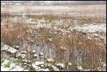
Then, this morning it snowed.  Just for reference, it was 80 degrees F last Sunday.  BUT… it made for some beautiful pictures.  At least I got this one.  This was as I was driving home from dropping off my son at school.  Then I got home and called my teacher.  At the end of the call he told me to go outside NOW and take some picture.  Stupid me, I did a few things around the house and then went out.  And everything was melty.  Should have listened to teacher.

20110418-

But I did get some interesting pictures.  The are all in pairs and I can’t figure out which pair to choose to show on Tuesday.  Unless I get something better tomorrow.  I was wondering if any readers had an opinion?

#1

20110418--2

20110418--3

#2

20110418--4

20110418--5

#3

20110418--6

20110418--7

#4

20110418--8

20110418--9

#5

20110418--10

20110418--11

#6

20110418--12

20110418--13

Tuesday, April 12, 2011

Photography Student: Class 2

So, by the way, my photography class is called Designing Your Photographs and is taught by Lou Nettelhorst who actually lives very close to us.  He also leads many other photography classes, seminars, outings and private lessons.

I think what I will do now is just try to throw in a few facts/pointers I learned in class along with the photos that I plan to submit for the assignments.

First (after going through all of the students’ photos for the previous week’s assignments) Lou talked about shapes and how we should try to go beyond labels of objects in order to see both primary and secondary shapes.   For instance, a flower can be a circle and a tree can be a triangle.  Each shape can represent a different feeling.  One tip was that too many shapes in a picture may prevent the viewer from seeing any coherent theme and may otherwise present as chaos or competition within the picture.

We are to submit one image of a shape that we have photographed that creates interest in the subject.  Here is mine:

20110409--4

Not sure how terrific this is other than I rarely notice/consciously recognize that objects are shapes.  I discovered that there are a lot of triangles out there, but had a hard time finding circles.  I’m sure there are a lot out there, I just need to look harder.  This is part of a roof of a bar in Antioch, IL.  It was quite a cloudy day.  I made the colors pop by playing with the color saturation and luminance.  I shoot in RAW format, which allows the “artist” to easily tweak the pictures after they are taken with special computer programs.  I am currently using Lightroom.

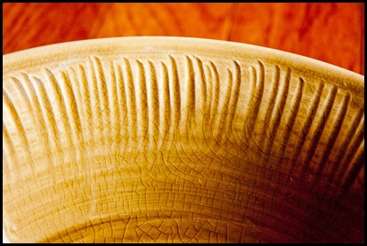
Next up was texture.  Texture is best highlighted by proper lighting and cropping.  Texture tends to provoke memories of what things feel like.  I had a hard time with this as the lighting hasn’t been really great, and when it was, I wasn’t feeling too great!  Now I have three that I need to choose from before class tonight.  Please feel free to vote!

20110409--8

The rim of one of our beloved salad bowls.  We love pottery and this is from a set that is one of our favorites.  Made by Alice Goldsmith.

20110412-

Close up of a garbage can outside of the Grayslake Park District building.

20110412--2

Bud getting ready to bloom outside of the Grayslake Park District building.

Finally we talked about perspective.  Perspective represents depth or distance and can be best created by distorting or deforming space (enlarge an object in relation to another).  We were near the end of class when talking about this, but I see some things Lou went through quickly from our handout.  I’d rather not write about it too much as I don’t quite have a handle on it myself, but basically it covers influences of our perceptions of depth in regards to light and what qualities represent closeness and distance.  So without further ado, here are my two images for the assignment:

20110409--2

This is a walkway through a nature area behind the main street in Antioch.  The little dead leaf, or whatever that is, is a little distracting…

20110409--3

This is a set of stairs behind a building on the main street in Antioch.

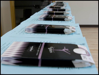
Here’s another I took today of tights lined up before my first dance class:

20110412--3

While I like the concept, I should have shut the bathroom door in the background!  Live and learn…


Just for fun, here are a couple of others I took that I like that may or may not follow any of the instructions for the assignments:

20110409--6

Close up of same stairwell as above.  I liked the peeling address numbers in red/orange and the green door in the background in contrast to the neutrally colored worn wood and brick.

20110409--5

Tin ceiling at Café Book in Antioch.  A cute and comfortable bookshop/café.  A little too flat to use for the texture assignment.

FYI, my submissions for last week’s assignment were well received.  Phew!!

Monday, April 11, 2011

Pillow Whip Up

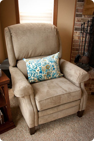
Recently we purchased a new recliner.  This purchase was to replace a VERY comfortable well loved leather chair and ottoman.  The previous chair had been pretty marred up by cat scratches.  Plus the green color was just not working with the room.

20110411--6

We spent a lot of time at the showroom deciding on the fabric color.  We brought swatches of the paint color, the carpet and all of the other upholstered fabric in the room.  Yet… when we got it delivered, it looked MUCH lighter than what the fabric sample looked like in the showroom.  In a way, it almost matches TOO much.  Like it blends in.  I decided it needed a pillow with a bit of color to brighten it up.  Jason suggested we try a fabric with blue in it.  First I looked through my stash.  Among other fabrics, I had a large swatch of upholstery fabric that looked like it was from a few decades ago based on the writing on the tag.  And even then, it was labeled “vintage”.  I wasn’t real sure about it, but once I laid that sample on the chair, Jason thought it was “the one”.  Either that, or he realized it was free, so go with it.  I found some canvas fabric to back it with and bought a pillow form at a local discount decorator fabric warehouse.

20110411-

The fabric itself had another colorway sewn to it in a spot that I needed to be a part of the pillow in order to center the floral bouquet.  I carefully took out the stitches and was left with big holes!  Luckily the fabric is fairly forgiving in its texture.  I ran my nails over the holes and ironed over them to help them disappear.  I think it did the trick.

20110411--2

I also decided to add a zipper, just in case we get tired of the cover, or just want to change it up a bit from time to time.

20110411--4

In the past I have done a lot of piping (cording) on my throw pillows, which does take a bit more time.  But even so, I was amazed how easy and quick this was for me.  ESPECIALLY with the zipper. 

I started back at sewing (after some sporadic minimal attempts) when I was pregnant with my son, by making pillows.  Since then, I have ventured into many other areas of sewing.  And now pillows?  They are so amazingly easy for me.  I guess it takes something like this to realize how far you have come.  And I’m not afraid of zippers (as much) anymore!!

20110411--5

On a side note: I am keeping something from you!  (Well, unless you are my friend on Facebook).  It is a sewing project which will be a gift for my son’s teacher.  I am so excited and pleased with the result and can’t wait to see her face.  It involves all of her students this year and it is something I kinda swore I wouldn’t be doing again for a long time after my last one.  But now… have I caught the bug?  Anyway, sorry, but you’ll have to wait until the end of May for this one!

Up soon (hopefully tomorrow): This week’s Photography Class Assignments!

Other topics I’d like to cover/revisit:

  • How my mail organizing system has worked for me.
  • Some slipcovers I made for our dining room chairs many months ago, which I never blogged about.
  • An interview (which my friend agreed to but which I have yet to prepare for and conduct) with my friend Tania who writes amazing poetry.

Monday, April 4, 2011

Photography Student

Both my husband and I have been interested in photography for quite a while.  We are blessed to have two nice digital SLRs between the two of us.  For a while it was just one and it would get frustrating when one wanted to use it, but the other had it.  My husband is a much better photographer than I, but I would like to get better.  So… I signed up for a class at our local community college, the College of Lake County.  It meets once a week on Tuesday evenings for 3 hours.  So far I’ve only had one class.  The main points I’ve learned are how light affects your pictures and how it is important to “make” your picture.  Mainly for me, I have started noticing my backgrounds and whether they add to or detract from the picture.  This week’s assignments are lines and light.  First we were to take several photos of straight lines and curved lines and bring one of each to class.  Here are mine:

Straight: (part of the roof of Central Bark in Grayslake)  Diagonal straight lines are supposed to suggest movement.

20110323-

Curved: (flag outside of the local Park District Building)  Not sure if this counts as curved, as the curves are due to motion in the wind.

20110323--2

The second part of the assignment was to take photos of two different items in direct light, side light and back light.  Only one study will be submitted.  Here are mine:

My subject: A bouquet of roses that were on sale at the grocery store.

Front lighting.  Supposedly causes the subject to look “flatter”. Hmmm.

20110401-

Side lighting.  Supposedly gives more dimension to the subject.  I would certainly say so.  More so than direct light, that’s for sure.

20110401--2

Back lighting.  Supposedly creates more of a silhouette.  In this case, it really gives some interesting affects.  Since the flowers have translucent petals, the light shines through them at certain points.  Though I don’t see much of a silhouette here per se, the shadows and lights are quite interesting and pretty.  I think it looks more romantic and dreamy.

20110401--3

Perhaps I AM learning some new things!  Hope this helps you if you are also looking for a few photo tips.  I’ll try to share more as I go along with the class.

~~~~~~~~~~~~~~~~~~~~~~~~~~~~~~~~~~~~~~~~~~

Oh, and here are some photos I thought were just cute, but see how the background (and other noise) kinda ruins or takes away from the pictures.  (These are not for the class).

Subject one: Paris, our younger girl kitty.  The bag of stuff on the chair and the bag on the floor by the door really ruin the picture!  She was so daintily balancing on the arm of that old chair and I love the back lighting here.

20110402--5

Subject two: Velvet, our older boy cat.  I came home on Sunday to this scene.  The blanket and pillows really detract!  My daughter had set up all of these stuffed animals at her pillow and it was so cute how Velvet seemed to want to join the pillow party.

20110403-

But really this one was worse:  Because of those cords!!!  I purposely changed angles to get the one above without the cords in the background.

20110403--2

The main problem here is that if I had taken the time to remove the offending objects, the subjects may have either gotten bored and moved on or gotten irritated by the movement and moved on.  So I guess the moral of the story is to always keep a perfectly clean house.  Ugh, right…

Related Posts Plugin for WordPress, Blogger...