So, by the way, my photography class is called Designing Your Photographs and is taught by Lou Nettelhorst who actually lives very close to us. He also leads many other photography classes, seminars, outings and private lessons.
I think what I will do now is just try to throw in a few facts/pointers I learned in class along with the photos that I plan to submit for the assignments.
First (after going through all of the students’ photos for the previous week’s assignments) Lou talked about shapes and how we should try to go beyond labels of objects in order to see both primary and secondary shapes. For instance, a flower can be a circle and a tree can be a triangle. Each shape can represent a different feeling. One tip was that too many shapes in a picture may prevent the viewer from seeing any coherent theme and may otherwise present as chaos or competition within the picture.
We are to submit one image of a shape that we have photographed that creates interest in the subject. Here is mine:
Not sure how terrific this is other than I rarely notice/consciously recognize that objects are shapes. I discovered that there are a lot of triangles out there, but had a hard time finding circles. I’m sure there are a lot out there, I just need to look harder. This is part of a roof of a bar in Antioch, IL. It was quite a cloudy day. I made the colors pop by playing with the color saturation and luminance. I shoot in RAW format, which allows the “artist” to easily tweak the pictures after they are taken with special computer programs. I am currently using Lightroom.
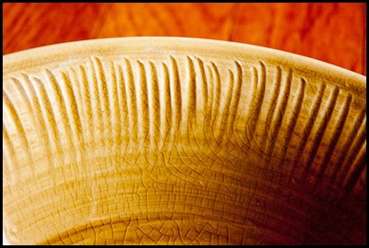
Next up was texture. Texture is best highlighted by proper lighting and cropping. Texture tends to provoke memories of what things feel like. I had a hard time with this as the lighting hasn’t been really great, and when it was, I wasn’t feeling too great! Now I have three that I need to choose from before class tonight. Please feel free to vote!
The rim of one of our beloved salad bowls. We love pottery and this is from a set that is one of our favorites. Made by Alice Goldsmith.
Close up of a garbage can outside of the Grayslake Park District building.
Bud getting ready to bloom outside of the Grayslake Park District building.
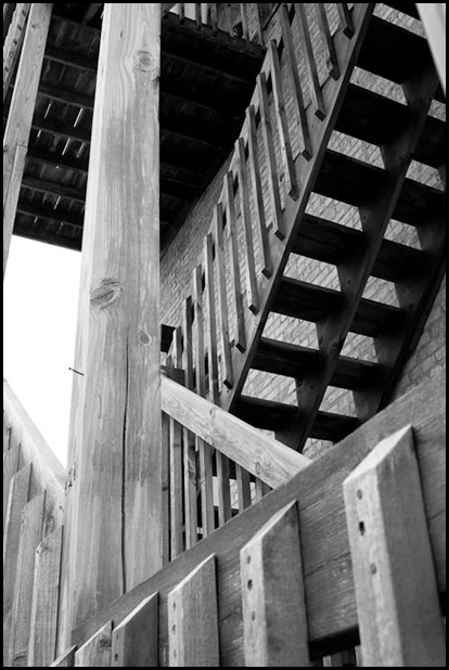
Finally we talked about perspective. Perspective represents depth or distance and can be best created by distorting or deforming space (enlarge an object in relation to another). We were near the end of class when talking about this, but I see some things Lou went through quickly from our handout. I’d rather not write about it too much as I don’t quite have a handle on it myself, but basically it covers influences of our perceptions of depth in regards to light and what qualities represent closeness and distance. So without further ado, here are my two images for the assignment:
This is a walkway through a nature area behind the main street in Antioch. The little dead leaf, or whatever that is, is a little distracting…
This is a set of stairs behind a building on the main street in Antioch.
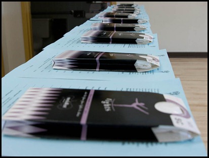
Here’s another I took today of tights lined up before my first dance class:
While I like the concept, I should have shut the bathroom door in the background! Live and learn…
Just for fun, here are a couple of others I took that I like that may or may not follow any of the instructions for the assignments:
Close up of same stairwell as above. I liked the peeling address numbers in red/orange and the green door in the background in contrast to the neutrally colored worn wood and brick.
Tin ceiling at Café Book in Antioch. A cute and comfortable bookshop/café. A little too flat to use for the texture assignment.
FYI, my submissions for last week’s assignment were well received. Phew!!


These are great Kristi. I like the saturation in the roof shot. Too bad it was so overcast though. I'm happy that you are using Lightroom to develop your images. Love it! The pattern of the garbage can in your texture series is sick (in a good way). The leaf doesn't bother me much and is an easy fix to delete it. Go in the develop mode in Lightroom. Go to the brushes (next to the cropping feature) and select Heal. Make the brush a little bigger than the leaf and zap it out of there. You can move the brush around so the wood matches around the leaf. Oh, and I love the depth of field you chose on this shot! Good job!!!
ReplyDeleteJim Youngs
Dear Kristi,
ReplyDeleteHi! Thanks for visiting my blog and leaving me a lovely comment:-) I love that You are in photography bec I am too.. i hope we can be blog friends, would be good to have friends from your side of the world..
Thanks for visiting and hope you can follow me..
I am following you now:-)